ART COLLECTOR 2021
INTERVIEW WITH LOUISE MARTIN-CHEW.
Original conversation as Zoom call-in for Art Collector Magazine. Video available on Youtube. Text edited for clarity.
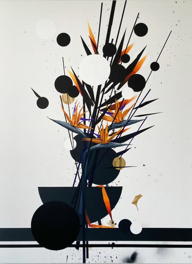
Louise Martin-Chew: I have the pleasure to be speaking to New York Artist Martin Basher about a painting, yet to be titled, to be shown with Starkwhite at the Auckland Art Fair next month. Martin is also working on a solo show for Starkwhite later this year. He's joining me on Zoom from a temporary Wellington studio while on a hiatus from Covid and the New York winter. Martin, could you please tell us a little about this work, its media and your use of the bird of paradise flower, and the way you've deconstructed that image?
Martin Basher: This series of paintings are something that I've been developing for a year or two. They are done in a variety of paints - enamels, acrylics and oils. They’re pretty hard-edged for for the most part. But they begin intentionally loose and dirty - my canvases start on the ground, accruing floor detritus. I lay them unstretched below my painting wall, where I use them as drop sheets. I let them pick up footprints and paint splatter while I'm working on other other pieces. After a time the canvas gets stretched, and I begin to paint my flowers with the incidental splatter and scuffs from the floor as my starting point.
The actual images are nominally still life, but the form is a vehicle for me to play with composition, surface and edge in a way that feels quite abstract too. Most of the composition is laid down in a hard edged manner, with masking tape - a procedure that's come out of various related aspects of my practice over the last 15 years. I love my masking tape! The actual paint is applied in various degrees of matte and gloss that play back and forth against each other. The flower forms and various bugs etc come at the end.
It can be a little hard to see in reproduction but the surfaces are quite dynamic in terms of the interplay of reflection and brush mark. Different sections and elements pop forward depending on how the ambient light rakes over the pictures’s surface. Some sections are pretty thick, sitting up off the canvas. Other sections appear to sink backward because they are so matte. The range of reflectivities means the works are really active as a viewer moves around a room.
As to the bird of paradise flower motif specifically, I've been working with it quite a lot recently. They are the official flower of Los Angeles, though they are actually a South African plant. They are incredibly hardy. I got interested in them on visits to LA to work with my gallery there. In Los Angeles they line the freeways, and often crowd garden beds with a density thats almost threatening. In contrast with the deciduous flora of the American north east, they felt incredibly exotic, but not entirely comfortable. They teeter on aggression with their shape, and, theres something almost alien in their density and hunger for territory. They somehow feel perfectly emblematic of LA - both beautiful and invasive, otherworldly, insistent, clinging to the verges of howling freeways and untended dirt in all the heat and exhaust, pushing up those sublime flowers that suggest violence as much as beauty.
Ive been pretty obsessed - I just did an entire show of them with my L.A. gallery, called Birds of Paradise. Ive gone as far as to buy tons of plastic ones, which feel like a perfect form, for whats more L.A. than an ersatz version of the real? The plastic flowers are what the work is really about.
LMC: And what do the paintings mean to you?
MB: The paintings are nominally talking about the natural world, but I'm super interested in thinking about them in a kind of a hyper-natural context too. I paint from the plastic versions, which have this rubbery look. They become representations of representations of the flower. Thats to say, I don't think of them as being pictures of the natural exactly, so much as I think of them as representations of sentiment of the natural.
I guess it’s a way of approaching nature at a time when the question of what nature means to humanity is really in question, you know?
Personally, I have a lot of complicated thoughts about how we engage with the environment and nature, and I guess for me, there was something about that specific LA freeway verge moment that has lodged in me. Those flower’s insistence, their tenacity, and their aggression. I guess these paintings are a way for me to negotiate these complications. They sit in the art historical canon of painted still life, but that canon is fundamentally about painting a bunch of dying shit - as distinct from say the landscape tradition which is much more about the scale and immensity of nature. The still life canon engages with temporality and death, with our dominion over the natural. And there are strong parallels in the Ikebana flower tradition, which is obviously of huge relevance for me too.
These are paintings about nature for sure, but its nature at remove - plastic flowers on abstract stems, nature as a compositional device, bugs that are drained to a monochrome. Whether they are ultimately a love song or a scream of despair is really up for the viewer. Either way the paintings are still beautiful, poised images. It's really not for me to dictate what they are saying.
LMC: The still lifes are also a major departure from the fade-stripe paintings that you showed in Auckland last year. Clearly we can see your interest in abstraction, and in the graduation of color in this work. And obviously there's an enduring interest in visual affect. Can you just talk to us about how that has manifest differently in this new series?
MB: The abstract fade work continues to be a very integrated and integral part of my practice. I see the two bodies of work as sympathetic to each other rather than divergent. There’s a certain formal linkage between the two series with all the hard edges and verticality, and with some of petal and leaf forms that echo the fade motif. In several upcoming projects I’ll be showing some of the fade-stripe works alongside these works as diptychs, and I’ve actually shown several pieces recently that have the abstract fade paintings directly overlaid on the still lifes.
With both the fades and these still life paintings, there’s also a shared interest in atmospheric space. Thats to say, that the abstract works have always been about phenomenological environment for me. They're absolutely dealing with atmosphere and light and landscape and sunsets. Their colours are derived from the natural, though again, through a double layer of separation, in that they use the colours of beach-scape screen savers and holiday travel posters. Like the still lifes, they are talking about nature but it’s an extra step removed; the idea of the idea. In a sense, the abstracts are actually more engaged with pictorial depth; the still life works employ a much flatter pictorial plane compared with the abstracts.
Another connection is tonal; I absolutely love building a show through interlinked color. The oranges and purples which are in this painting are also playing through all the work in my studio right now, from the flowers into the abstract work too. My next show will be deeply tinted in this palette.
Overall, I see the two modes of working as co-evolutionary. Along with a third element to my painting practice - photoreal renderings of the beach screen saver images, all the work is trying to negotiate this weird place of the nature-adjacent. Maybe its a post-nature of a sort. I’ve spent a lot of time in the imaginary worlds of the writer J. G. Ballard, and my paintings aspire to a similar evocation of spaces that are just this side of the uncanny, yet still deeply recognisable and present.
LMC: I understand you haven't yet given this work a title. Can your talk to us about any ideas you've got or give us an insight into how that works?
MB: In the last few years I've tended to leave works untitled. I find titles can become terribly didactic, and I prefer to leave the content open for interpretation. But that said, I do love the the potential of ambiguity and double entendre - which I’ve leaned into for exhibition titles especially. Since these works are both beautiful and dirty, and have connotations of both the sharp and the malleable and soft, they feel like double entendre themselves, so I’m playing around with some of these ideas and hopefully I’ll pull some interesting titles out of all of that.